Tuesday, August 31, 2010

Green Machine

Well, the family room has gone from red to green.  My sister in law said that we should have left one wall red for Christmas.  :)  I think I'll skip it this time around.

It's not exactly the tranquil light green that I was hoping for, but I still like it.  We decided to go with two shades of green, rather than just one for the whole space.  The family room is pretty large - there's easily enough space on the one side for another bedroom - so we were thinking that the entire thing painted one color could be overwhelming.  Plus, we really couldn't decide on just one color.  Thankfully, my genius big brother Donnie Vendetta suggested painting the two spaces a different color.  Brilliant.  TV room on one side, and, I don't know - game room or something else similar on the other side.  Maybe a bari-ish area?  I'm not certain what's going to go over there, but I know one thing - I heart the green!!

Before, lovely red:


We took this pic on the first trip through when we visited (and also knew that we were totally going to buy the thing!).

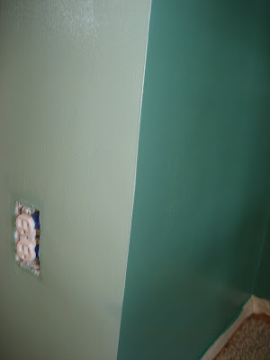
And after.  Unfinished, as you can see!:


That would be brother mine, paiting the lighter green side.


That would be PePe the cat in the window on the darker (potential bar/game room/something else) side.


Here's a combination of the two colors.  They're lovely.  Like I said, a little bit more intense (they both dried darker than they look here - naturally) than I was looking for, but I do like them mucho.  I just can't wait to do the decorating!  I see lots of black and white in my future...


OH, and one other little thing - this is my 50th blog (48th actual post, I believe?)!!!

Thursday, August 26, 2010

Bedroom!

No, not ours.  I have a feeling that's going to be the last room "finished" in the house...first room painted, last room finished.  Naturally.

This is about the upstairs guest room.  When we bought Casa del pv, it looked like this:


Yeah.  My *personal* favorite feature was the wallpaper border.  Why?  Because A) it had FISH on it, and B) it was VINYL.  As in, the wallpaper border you put in your bathroom because it's water resistant.  Ever try to remove one of those borders?  It ain't pretty.  The vinyl top layer peels off pretty easily.  The bottom, sticky part does. not. budge.  I was pretty sure I could even hear it singing "We shall Overcome" with its little fibers all linked.  We ended up having to go to our trusty neighborhood Sherwin-Williams and get a wallpaper remover product (and then got asked by the nice fella behind the counter "How'd that Dif work for ya?" every time we came in over the next 8 months...).  The Dif worked a miracle, in case you were wondering.  Spray it on, wait some time, scrape it off.  It did leave a slight neon blue stain on the walls where it had been accidentally sprayed, which we just primed over once it was wiped and dry.  Wallpaper gone, it was time to paint.

We were looking to the future with this room.  We knew that we were going to plan to have kids probably at SOME point while in this house (settle down, sister...).  So, this room needed to look good as a guest room now, and make a successful transition to a nursery later.  Naturally, we went with deep chocolate brown.  That's a kid's color, right?  :)  We figured that we'd be able to add gender-specific details later that would look fantastic - a bold pink for a girl, a sharp turquoise for a boy.

But for now, it needed to function as a place where guests would feel comfortable.  So, it went from above (yikes) to below:


There are still things to do (art on the walls, for example...), but I think it's quite the improvement.  But then, I'm biased.  :)

Wednesday, August 25, 2010

Thanks, YHL!

So, while touring my favorite little blog, Young House Love, I found a neat little article about LA lady Nancy Meyers.  She's had her hands on some great rom-coms, ranging from "Father of the Bride" to the more recent "It's Complicated."  YHL was showcasing some of the great sets from her movies, and I had to stop at the first one!

I'm sure from past blogs, you've come to realize that I'm not much of a "shabby chic" or "country" or even "seaside cottage" kind of girl.  So, it's not necessarily the house that I'm interested in.


Look to the front left.  That's not a...is it?  YES, it IS a drum!!!  As a SIDE TABLE!  Yeah.  This is going in my house.  Once I get back from my much-anticipated European Domination Tour (round 1), this is going to be the first thing on my list.  I'm ideally looking for one that is older, used.  Something maybe with an old school or band logo on it?  Probably something in the red, orange, or even yellow color family.  Preferably with glitter.  So, keep your eyes peeled, world.

I feel now that I have to also note the awesome bench-turned-coffee table as well.  I love the color, and the fabric.  Sumptuous!  I could handle having that in my living room, or maybe even a screen porch (it would live in the downstairs entryway during the winter).  More and more, I'm coming to like the concept of something cushy as the coffee table, with a couple of trays as hard surfaces.  People are going to put their feet up on your coffee table anyway; you might as well make them comfortable doing it!  :)

Monday, August 2, 2010

One down, two to go...

That's painting projects.  Okay, wait.  Let me be more specific.  That's ROOM painting projects.  We got the dining/living/hall/entry done this weekend.  Thanks to my AWESOME in laws, it was a breeze.  A five-hour, hot-because-we-took-down-the-shades breeze.

So, without further ado, here's a before (as in, WAY before - when we first looked at the house before we bought it!) shot into the dining room, from the living room:

Sorry, it's a little dark.  But, it shows off the lovely monochromatic look of the joint quite perfectly.

NOW, here's the after, from a different angle into the dining room, with a snippet of the kitchen beyond:


You'll have to excuse both the mess and the blurriness of the pic.  Painting is messy business, and my cell was the only camera I had on me.  :)  You can see how the new walls go with the feature wall (blue) and the orange (hmmm...it looks kinda salmon-y in this shot...) of the kitchen.  I also like that you can't see any of the golden oak trim that I'm dying to get rid of.  It makes the room look even nicer.

Here's a close-up of the three colors together:


I love them together!  Just a little cleanup of the lines, and we'll be good to go!

Up next:
Painting my Nana's dresser a lacquered black and moving it to the dining room to act as a kind of buffet table.  It'll go under those floating shelves on the blue wall.  My "nice" china (read:  the stuff that NEVER gets used...), table linens, and candle paraphernalia will make their home there.
Currently in the works, I need to finish painting a side table (a groovy 70s number with a built-in magazine rack) and an old coffee table a shiny white.  Our small jungle of houseplants will be living on the coffee table, and I'm not exactly sure where the side table will go - probably between this great set of old chairs I bought from my friend Erin (one is in the pic above - under the floating shelves!), which will be migrating to the living room until I twist my husband's arm enough to buy a new couch.  :)

Up next in room painting:
Another bedroom and the family room.  How many coats of paint and primer do you think it'll take to cover up this red??


Especially if we go with a lighter color. We're currently thinking a lighter celery green up and a darker moss green down, using the ledge that runs around about half the room as a dividing point. All that wood will be going white. Or, in the case of the fireplace, stone.

Long post short - it was a good weekend.