Wednesday, April 28, 2010

Cabin chic?

I think these are ADORABLE.  Mr. Peavs, however, isn't sold.


They're home-made twig pushpins and knobs!  So cute.   I'm thinking of putting something like this on the shelves in our dining room.  Above the dresser-turned-buffet, with cups and plates and other knick-knacks.


I even think the grass heart is ridiculously adorable.  Photos - some old, some new, B&W and color, postcards, buttons, coasters, concert tickets...oh, man.  I also really like the board - an old frame with a muslin or linen-covered board (cork?).  I like the neutral look of the thing.  Perfect for the black and white and blue and gray of my dining room.

Lastly, here's a close-up.  TOO CUTE.


Thanks, Design*Sponge!!

Saturday, April 24, 2010

However...

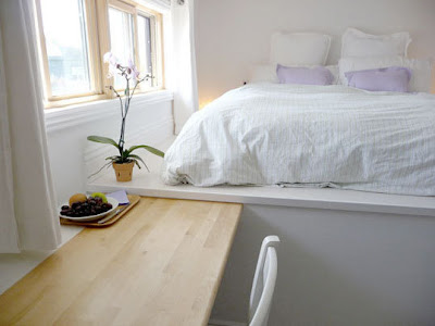
THIS loft set up I could handle.  It's interesting and fun.  Plus, it would be a GREAT way to have a ton of storage.  I'm filing this one away into the "if/when I ever have a great refurbed warehouse space in which to live."  It would definitely be out of place in the split entry.  :)


Not for everyone...

This picture makes my tummy hurt.  It makes me worry about falling.  I'm really good at falling.  I can see myself taking a tumble trying to get up to my bed.  Like, every time I went to bed.  Not awesome.


Aesthetically cool, but not practical.  Especially with the baby I infer is there - based on the crib on the right.

Thursday, April 22, 2010

backyard!

It's that time again, kids.  It's getting warm and beautiful.  The grass is green, the trees are blooming, and one of my hastas is already leafed out.  It's time to think about The Backyard.

This is what our backyard currently looks like:


and


Obviously, our yard ends where hubby is standing.  These are pics from late summer '08 - our lawn is now as nice and green and lovely as our neighbors' lawn.

This winter, the patio shifted and messed with our deck.  SO, the patio needs to be busted up and re-done to prevent that crap from happening again.  Either with more cement or some other medium.  We would like to turn the underside of our deck into a nice little screen porch.  Complete with a tin roof, a couple of doors to the outside world, and maybe even a hammock or two.  I'm envisioning it as a great place to leave the cats and be comfortable with them out there by themselves.  A place to read a good book on a lazy Sunday or have a nice glass of wine with friends and keep out the bugs.

And that's just one of the things that we need to do around Casa del Peavey outside.

Oh, here is a Legos rendering of the ideal backyard.


You'll note that The Backyard is a happy place - one where pirates can get along with knights and spacement.  It's practically Utopia.  This is seriously is a lot like what we want The Backyard to look like:  an expanse of green on the right, a big 'ol patio with a fire pit and built-in chairs on the left, connected to a deck that extends a bit out over the pond in the back.  Trees, flowers, and  a lovely fence to keep the furry kids inside...  I'm planning on getting started on this puppy started in the next couple of weekends.  Out comes the weed garden right outside the back door.  Out come all the rocks around the house - to later be replaced in roughly the same places...  :)  The Backyard is something that I have a huge passion about because I just want to have a lovely backyard.  We've got a few years in the current Casa del Peavey though, so we've got a couple of summers to get this baby up to par.

Friday, April 16, 2010

Southern love

Current favorite house:


It is the home of designer Ty Larkins in Louisiana.  House Beautiful did an article on getting a new twist on Traditional design.  I think I loved every picture featured in the article.  Someday, when I win the lottery (tomorrow?  I did buy the tickets!!), I'm going to own a gorgeous traditional house like this in Minneapolis (as a matter of fact, I already have the house picked out...), and hire Larkins to come and design it.  I really appreciate the fact that he's working with the history of his home, but updating it so that it reflects the new ideas of wealth and comfort and home.  For example, there is this picture of his kitchen:


In the article, he said that he designed this kitchen to be simple, like the staff kitchens of early-20th-century Southern mansions; "generous in size, but always very simple."  That's a perfect description of this room, and I really appreciated the fact that he didn't want to make it into the kind of sleek, modern kitchen that you see in a lot of the older mansions that someone updated.  He worked with what the room and the history of the place had to offer, but he made it updated.

This is probably my favorite room in the house:


I love the masculine feel of this library.  It is exactly how I think a library or study should look in an older home.  With one exception - I would have figured out a way to add in heavy velvet drapes to give the room that smoky, manly feel.  It's the kind of place that makes you long for a rainy Saturday alone, so that you can just sink into the couch and sit with your nose in a book all day.

I'm going to be printing out this whole article, and pasting it into my "WANT" book.

Sunday, April 11, 2010

Franciscan

New thing to collect:  Franciscan Starburst ceramics.

tlynn first pointed this out to me, so I fully blame her for my obsession.  Within a day or two of realizing my everlasting love, I jumped on Ebay and ordered myself up a gravy boat.  The fact that it's in a bit of rough shape meant that I got it for $14 shipped.  :)  I'm down with that.  This is my "everyday use" piece.  What I think I like most about it is the mod-deco look of the pattern.  It just feels very cool.  I can see this being the pattern the hip young people got.  It looks like it could very much fit both into the Jetsons' house and the Drapers.  The base color of the ceramics is this cream color with darker flecks.  It kind of looks like GOOD vanilla ice cream.  I've found myself liking blues and greens more and more in the last couple of years, and the colors of the dots definitely keep going with the cool flow.  I think these pieces will look great up near my blue dining room wall.

I think I've decided that I'm really only interested in the serving pieces, not the plates and mugs.  The canisters and casserole dishes and serving pieces are what I'm most interested in.  And another gravy boat.

Monday, April 5, 2010

thanks T&D...babies on the brain!

As previously mentioned, the baby fever has officially hit.  Don't tell Mom.

SO, I was surfing the blogs I love, and came across some nurseries.  Don't tell my MIL.

These are from sarah.wandering.


This one *maybe* borders on shabby chic, but not enough for me to not like it.  I really love the yellow.  I'm kind of suddenly into it.  The birdhouses make the sparrows on the ceiling just that much cuter.  This would be a really cute room for someone who doesn't know the gender of the baby on the way.  Throw some more masculine items in there (I'm thinking old trucks, maybe puppies or bears) for a boy, and cute it up for a girl  (more lace and cutesy bears).


It's the brown and white.  LOVE IT.  I also really enjoy the graphic print of the wallpaper.  There's a lot about the room that I love.  The dual windows with their seats, the shelves between the windows, the FLOOR!  I really like the green in there with the plants too.  I think I might try and find a long-living green plant that stays nicely small and put it in the window when I have a baby pv.


LOVE this tree!  Even I could do something like this.  That's kind of a big deal.  (for those who may not know - this doesn't include my only two readers...haha - I'm not exactly the crreative type.)  This may even kind of go with the first one.  The birdhouse really sold it for me.  :)  I like that the tree is kind of silver.  That makes it a little more glamorous.  I likes.


I'm really not sure which part of this room I like better - the color blocks, the wallpaper monkey, the beautiful bed and crisp linens on it, the mobile...  I think the biggest seller of this one is the fact that the walls in the room that will "eventually" be a baby's room are this exact color.  :)  I really like this room.  It's pretty much a great, graphic, modern room for either a boy or a girl.

Thursday, April 1, 2010

i heart

Design*Sponge.
Today's sweet find is a little old.  :)  And that's cool.  I've been keeping a relatively low internet profile lately.  I'm playing a mean game of catch-up now.  The Sponge team gave a sneak peek of writer/blogger Kelly Doust's pad.  There are some really great little features to it that just make me jealous.  I find myself wishing I could do a better job of being an eclectic designer.  I'll keep an eye on Ms. Doust - she does a fantastic job of it.  Here are some little bits I dig.


According to the article, this bedroom used to be a study.  What a fantastic place for a bedroom.  I would LOVE to be surrounded by my books, in such a lovely, warm, sunny room.  I'm thinking I would like it to be a little more modern (naturally), but overall I love the room.  Especially the books!


Favorite part of the kitchen is hands-down the dinosaur.  I'm going to find myself a bright dinosaur.  I'm thinking maybe an electric blue.  Or, paint one white and give it some turquoise accents.  How fun!


LOVE.  Again, with the books in the corner.  I really appreciate the look of the door-turned-mirror.  It's totally too country life for us, but I wouldn't mind finding a way to figure out how to make this work in a Mid-Century Modern joint.  I'm not certain if this is a bathroom or a hallway/entry, but I like it for either way.  I think it's a creative way to put a mirror in a room.  Makes it look like a window, too, which always makes a room look bigger.  I'm a fan.  I think this would be fun to do if you have the nice, big area of wall.  I could probably do something like this in our entry downstairs, but I've got some art currently living on that wall.  Maybe next time...